March 2017 / The Authenticity of Design
Located throughout the world, the Trendease Team continues to deliver our subscribers around the globe must-know market information and inspiration straight to their computer screens.
What is genuine? What is original? Authenticity has an origin reinforced by unquestionable evidence of what is true. We demand authenticity from the people around us as much as the products we purchase day in and day out. These bona fide designs could be rich in heritage or be a result of bleeding-edge innovations resulting from dedicated research and development. Supporting product examples and numerous Pantone colors stories can be found in the virtual pages of Trendease this month. Get inspired with the March edition!
We attend over 100 design events a year on your behalf to bring you trend insights and design movements to help you maintain cutting-edge knowledge of the lifestyle and design markets. Currently we keep readers within 173 countries/territories in the know! Are you reading Trendease.com?
Show us what youve got! For editorial consideration please email editorial@trendease.com with your latest original designs. Upcoming Trendease Market Edge PowWows and Trendease.TV information can be found on the homepage.
REPORTING TO INSPIRE,
Jennifer Castoldi,
Chief Creative Director
Download our informative tri-fold brochure as a PDF file here.
Features and Articles

|
Jennifer's March MusingsGhent — In the March edition of Trendease you will be able to access a number of reports from the exhibitions which we have been attending. A word we frequently encounter these days, not just in design, but also society, is authentic. People are craving realness, trueness, honesty, not a copy or a fake. Whether it refers to a classic or an innovation, the definition remains the same. Handcrafted creations and imperfections are full of character. Delicacy and thoughtfulness are assets. |

|
Ambiente: Delicate StructuresFrankfurt — For the trends of 2017 at Ambiente, style bureau bora.herke.palmisano has focused on sustainably inspiring structures, materials, patterns, and shapes. Of specific interest to the consumer goods sector are the honest handling of materials and the clarity of design, as well as surprising patterns and textures. Without straining for superficial effects, creators are striking out passionately in new directions. |

|
Ambiente: Honest MaterialsFrankfurt — It is about the powerful attraction of authentic design. High-quality handwork artistry in which value is attached to design keeps traditions alive. The careful handling of original materials gives rise to grounded products as unobtrusive as they are durable. Subscribers can log in to see over 100 products, note the Pantone color references, buzzwords, and design details. |

|
Ambiente: Jumbled PatternFrankfurt — Jumbled Pattern is an homage to the carefree spirit of childhood, an invitation to further fantasy. In the uninhibited juxtaposition of patterns and motifs, not only drollery but also nostalgia and inventiveness come into their own. In this gallery subscribers will find over 40 supporting images, a Pantone color story, design details, and buzzwords that capture the theme. |

|
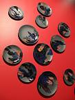
Ambiente: Notable ShapesFrankfurt — The design direction of Notable Shapes is rich with contrasting surfaces, striking combinations, distinctive inlays, diamond motifs, and geometric patterns. Words such as distinctive, powerful, solitary, and precise are characteristic of this trend. This gallery boasts dozens of images, descriptions, and a Pantone color story to inspire our subscribers. |
|
Creativeworld: ImperfectFrankfurt — Inspiring ideas for making things is the purpose of the trend areas at Creativeworld. The designers at style bureau bora.herke.palmisano pinpoint this year's trends and have come up with three directions: Imperfect, Thoughtful, and Whimsy. Showcased are the exhibiting manufacturers materials and tools, which are utilized to create individual items. Imperfect is the new perfection. |

|
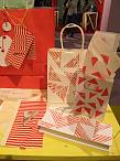
Creativeworld: ThoughtfulFrankfurt — See lifestyle in all its semblances, from apparel and home accessories for the home to creative office concepts and ideas for gifts and packaging. Thoughtful is laced through with delicate patterns like lines, circles, crosshatches or flowers across all technologies like printing, weaving or knitting. This style uses neutral grey, black and white nuanced colors which are complemented by pastel shades. |
|
Creativeworld: WhimsyFrankfurt — Whimsy is a trend full of contrast. Intense colors and many patterns are mixed, patched together, overlaid, and randomly combined to create objects for fashion and the home. It is humorous, playful, bizarre or lively: a simple definition of direction whimsy. Knitting, stamping, knotting, and using decorative tape are just a few applications within this trend. |

|
NEWSLETTER #574 - Christmas in SpringFrankfurt — Trendease is giving subscribers an extra dose of inspiration this week with 5 new galleries and 4 color stories with Pantone references! While Christmas and the festive season may seem miles away, a number of design professionals, mainly retailers, are already having visions of sugarplums dance through their heads. |

|
Christmasworld: a fanciful celebration of joyFrankfurt — Happy moments of relaxation provide a carefree sense of enjoyment in this sub theme a fanciful celebration of joy of the Christmasworld Trends 2017/18 by bora.herke.palmisano presented in the Messe Frankfurt. Subscribers are invited to delight in over 40 supporting images and a color story with Pantone references. |

|
Christmasworld: a valuable handling with traditionFrankfurt — Craftsmanship, tradition, and items made with passion last much longer than the single moment in a valuable handling with tradition, the second theme presented for the delightful moment Christmasworld trends of 2017/18. In addition to the color story with Pantone color references, subscribers can view 30+ product photos here. |

|
Christmasworld: a gentle touch of natureFrankfurt — In a gentle touch of nature it is all about soothing moments of naturalness and calm to create sensitivity and a feeling of well-being for the 2017/18 season. Color accents in this color story with Pantone references include gold and coral, not your traditional hues for the holidays |

|
Christmasworld: a distinctive figure of modernityFrankfurt — A distinctive figure of modernity is where stylish moments lend elegance to the familiar. Black matte and glossy ceramics are dolled up with gold and paired with glass, paper, occasionally accented with geometric designs. This trend direction for 2017/18 also contains a color story with Pantone references for the coming seasons. |
|
NEWSLETTER #575 - Biodesign for a New EraNew York — Zero waste is a phrase many designers are aiming to include in the production of their visions. Textiles embedded with novel technologies and biodesign are fields advancing the industry and taking it to a place that is unknown and unfamiliar to all of us. The possibilities are endless and the change is terrifying, but the fact that these innovations are taking place is something that cannot be ignored. |

|
NEWSLETTER #576 - The Connected HomeWorldwide — As you may know, Trendease is curating the new technology section launching at MoOD Brussels this September 6-8 referred to as MoOD Tech. We have a number of confirmed exhibitors working with cutting-edge innovations such as conductive embroidery and yarns (think supplier to help to manufacture heated sofas, LED curtains, or floor covering assisted well-being). Here you can read some tidbits on the smart home. |
